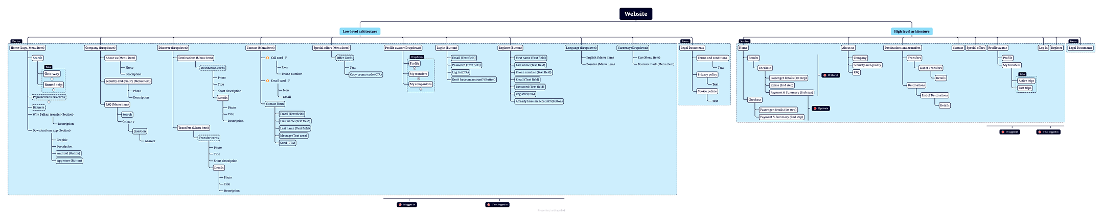
Balkan Transfer

2023 / Based on Bosnia and Herzegovina

Role: UI/UX Lead

Working on Balkan Transfers was a great opportunity to demonstrate my leadership skills and contribute meaningfully to the entire design process. The overall project consisted of four products: a marketing website, an admin dashboard, a passenger app, and a driver app. Here, I’ll focus on the website phase.Working on Balkan Transfers was a good chance for me to prove my leading skills and to show what can I add to the design process.

I began by introducing the team to a structured approach for conducting competitor analysis — using a colorful and engaging format that made the process not only insightful but fun. Next, I led the creation of user personas, followed by a detailed information architecture. This level of IA detail was new for the team and challenging, but ultimately very rewarding.

We then moved into wireframing, developed a style guide, and built out a set of atomic design components to ensure consistency across the UI. Once approved, we implemented the final UI and prepared for handoff.

At every step, we actively communicated with the client — presenting progress, gathering feedback, explaining our rationale, and yes, occasionally debating constructively. In the end, both the team and the client were highly satisfied with the final outcome.

Competitor Analysis

To kick off the project, we conducted a detailed competitor analysis, focusing on six platforms — both direct and indirect competitors in the transportation space. This helped us understand the product landscape more clearly and identify UX patterns, strengths, and pain points.

Although we all use transportation platforms regularly, reviewing them side by side in detail helped us move from everyday familiarity to strategic insight. We used a hands-on, color-coded system to capture our observations:
🟢 Green post-its for positives
🔴 Red post-its for negatives
🟡 Yellow post-its for ideas or suggestions that came to mind during the review

We also used fun stickers to mark standout areas — such as a good approach, a perfect approach, ideas we’d like to explore, or spots where we thought something could be improved.

In addition to the websites, we analyzed three different mobile applications. This broadened our understanding of the product space and helped us start thinking about the mobile version and app flows early in the process.

User Persona: Meet Susan Anderson

To understand our users better, we created two personas. One was a frequent domestic traveler based in Bosnia and Herzegovina. The other — and the one we’ll focus on here — was Susan Anderson, a digital nomad who travels internationally.

Susan is an organized, independent traveler who often books rides between unfamiliar locations. She's creative, tech-savvy, and values efficiency and clarity in any platform she uses. We defined her goals, motivations, needs, and expectations to better shape our design decisions.

Once Susan was established, we mapped two user flows for her, based on the existing platform:

1.  An ideal "best-case scenario" where everything works almost as expected .
2. A realistic scenario, based on actual usage, including moments of friction or confusion.

We used the product ourselves several times to ground this process in real-life behavior. These flows helped us uncover both pain points and moments of smooth UX. This understanding brought us one step closer to building a product that not only works — but feels good to use.

Information Architecture

Creating the information architecture (IA) was one of the most fascinating stages of the project. By this point, we had a deep understanding of the product — enough to define how the entire structure should be organized and what content belonged under each page.

Throughout the process, we worked closely with the client, gathering feedback frequently. Sometimes their feedback led to small changes, and other times, the way we visualized the product in our minds — and in Xmind, our IA tool — helped shift their thinking entirely. These conversations shaped the structure collaboratively, which made the IA much more aligned with both user and business needs.

One of our key goals was to clearly define whether each element on the platform would be interactive or static/read-only. Getting this right early helped us avoid confusion later and drastically sped up the wireframing process.

The final IA is quite complex, so in our documentation, I chose to collapse most of the detail pages for clarity and focus.

Wireframing

With a solid information architecture and well-defined user flows, we began translating our research into low-fidelity wireframes. At this stage, our goal was to focus entirely on structure, hierarchy, and functionality — without getting distracted by colors or visual polish.

The insights from our competitor analysis helped us avoid common UX pitfalls, while our personas and user flows ensured the layout supported real-life behavior — not just ideal scenarios. Each screen was built with Susan (our persona) in mind, especially thinking about how she'd interact with the system while traveling or making quick decisions on the go.

Thanks to the clarity of the IA, we were able to move through the wireframing phase quickly. Every element already had a defined purpose: whether it was static content, an interactive button, or a dynamic data component. This allowed the wireframes to act not just as design tools, but as a shared language between the design team, developers, and the client.

We used the wireframes to:Test flows internallyPresent ideas to the client before moving to UIAlign technical expectations early.

This phase was highly collaborative and iterative — we often refined wireframes based on feedback or new insights from edge cases we hadn’t initially considered.

Style Guide

Before jumping into UI design, we created a style guide to establish the visual foundation of the product. This included:

Typography: A clean, modern typeface with defined styles for headings, body text, and buttons to ensure clear hierarchy and readability.

Spacing: A consistent spacing system that helped us maintain alignment and rhythm across layouts.

Color Palette: A carefully selected set of brand, neutral, and status colors, tested for accessibility and contrast.

Shadows: A subtle shadow system to define elevation and hierarchy without adding visual noise.Having this guide made the UI process faster, more consistent, and easier to hand off to developers.

UI Design

With the style guide and wireframes in place, we moved on to high-fidelity UI design. Our focus was on creating a clean, modern interface that felt intuitive and visually consistent across web, mobile, and admin platforms.

We applied the design system we built — using consistent typography, spacing, colors, and components — while refining details like button states, form inputs, empty states, and error handling.

Throughout the process, we regularly shared updates with the client, gathered feedback, and made iterative improvements. Every screen was designed with real-world use in mind, staying true to the user flows we developed earlier.

The final UI struck a balance between usability and visual polish — simple enough to use without effort, but engaging enough to feel trustworthy and branded.