Cuckoo

2022 - Present / Based on Finland

I have been working as a UX/UI Designer with Cuckoo for the past year. During this time, I have worked closely with the development team to improve the user experience of the Cuckoo app.

One of the things that I appreciate most about Cuckoo is that they are always listening to their users and open to new ideas. We have a weekly meeting where we discuss feedback from users and brainstorm ways to improve the app.

I am proud of the work that we have done to improve the user experience of the Cuckoo app. We have made it easier for users to find the information they need and to get the most out of the app and we are continuing to do that!

Home page

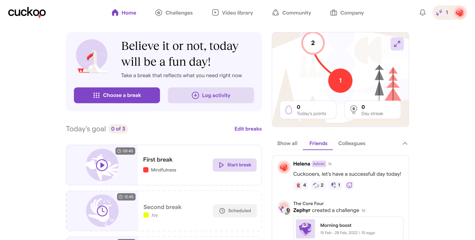
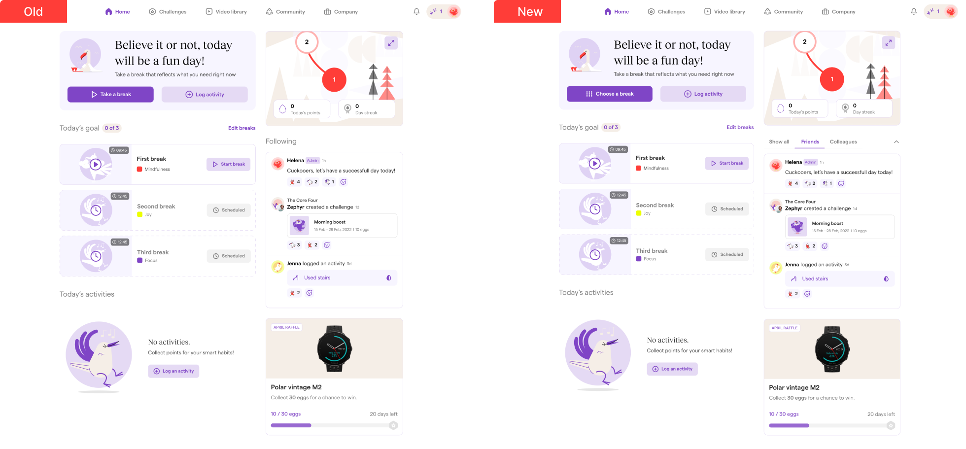
We recently made a small but effective change to the homepage of our app: we changed the "Take a break" button to "Choose a break."

This change may seem minor, but it has had a big impact on the user experience. We received feedback from a user who said they couldn't find where to find break options on the homepage without going to the video library. This was because the difference between the "Take a break" button and the "Start break" button was not clear.

We realized that we were using the same "play" icon for different actions, which was confusing to users. We also realized that the label "Take a break" was not clear, as it didn't explain what the button did.

To address these problems, we changed the icon and label of the button to "Choose a break." This new icon and label are more clear and descriptive, and they help users to understand what the button does.

Since making this change, we have received positive feedback from our users. They appreciate the new icon and label, and they find it easier to choose a break from the homepage.

This example shows how even a small change to a button can have a big impact on the user experience. By carefully considering the icon, label, and placement of buttons, we can make our apps more user-friendly and efficient.

Video library

Here are some of the changes we made to the Video library page:

Removed one of the filters.
We had three filters, but two of them were basically the same, with the same options. So, we removed one of the filters and kept only "Tags" and "Categories."

Removed the play icon from the thumbnails. Since this is a video-based product, everything in the Video library (and on the platform) is a video. So, we removed the play icon and its purple background to make the page look cleaner and give it more breathing room.

Changed the way display selected tags. In the old design, users would select the tags they wanted, and after clicking the "Show results" button, we would only see how many tags they had selected. This approach had a few problems: users had to reopen the dropdown menu to see the tags they had selected and to remove the filters they had chosen. So, we decided to use chips for the tags. Now, after selecting tags, users can see them directly in the dropdown menu as chips, and they can easily remove them by clicking the remove icon.

We believe that these changes make the Video library page more user-friendly and efficient. Users can now more easily find the videos they want to watch, and they can do so in a more visually appealing way.
We also made some changes to the platform.

Added an "Add to favorites" feature.
When I started working at Cuckoo, I realized that there was no way for users to save their favorite videos. So, I proposed adding an "Add to favorites" feature, and together with the development team, we decided to add it immediately. I decided to add a "My favorites" button to the header using our primary button. We also needed to decide where to put the "Add to favorites" feature on the video card. This may seem simple, but since we don't have any other actions or options for the video cards and our user personas are typically 40+ working women, I added heart icons to each visible thumbnail so that our users don't need to go through a discovery phase and can quickly adapt to the new feature.

Added three sections to the Video library page to help people find the right break videos for them. Another challenge I faced was how to help people discover new videos without having to spend time filtering through a long list of options. After some research, I came up with the idea of creating three sections: "Previously watched," "Most viewed," and "Recommended for you." The "Previously watched" section shows users the videos they have watched recently. The "Most viewed" section shows users the most popular videos on the platform. And the "Recommended for you" section shows users videos that are based on their interests and viewing history.

We believe that these changes make the Cuckoo platform more user-friendly and efficient. Users can now save their favorite videos, and they can more easily find the videos they want to watch.

Completed challenge

I redesigned the way completed challenges are displayed on our platform. I did this in response to feedback from users who said they had difficulty distinguishing between ongoing and completed challenges. One of the changes I made was to add a purple tick mark with a circle background to the top right of the avatar for completed challenges. I did not center the tick mark on the challenge image because sometimes challenges have sponsors and we use their logos as the challenge image. I wanted to avoid obscuring the sponsor logo with the tick mark.

New challenges

We had three pre-defined challenges and one custom challenge called "Set a goal." After a meeting with the Cuckoo development team, we decided to add another custom challenge called "Most points."
For the "Set a goal" challenge, you define the schedule and point amount, and the winner is the first person to reach the goal. For example, you could create a challenge to reach 30 points in 7 days.
For the "Most points" challenge, you also define the schedule, but the winner is the person with the most points at the end of the challenge. For example, you could create a challenge to earn the most points in a week.

We also added a new one-on-one challenge called "Quick challenge." This allows users to challenge their friends immediately, without having to create a group challenge. To do this, users can simply go to their friend's profile and click the "Challenge" button.

We believe that these new challenges will make our platform more engaging and fun for users. They provide users with more flexibility and control over their challenges, and they make it easier for users to challenge their friends.

Community

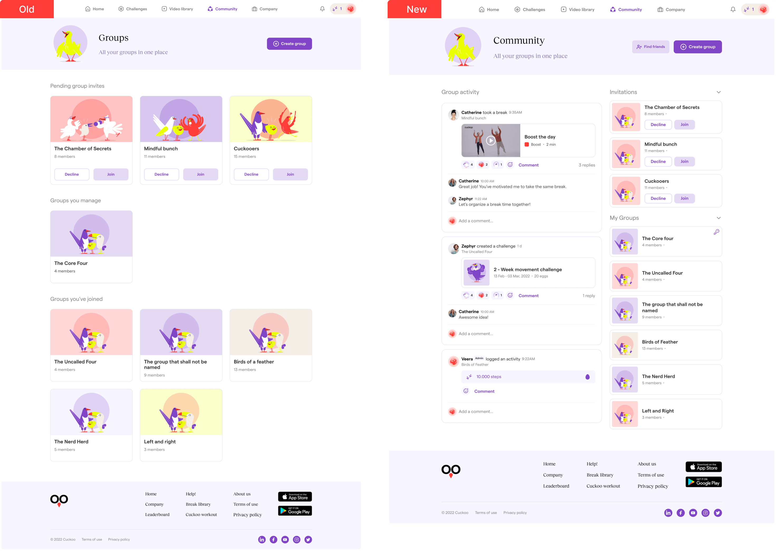
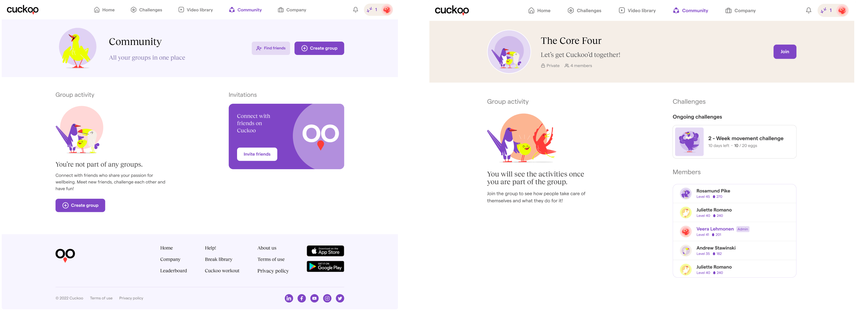
One of the biggest changes in the new app is the Community page.
In the old version, users had to go to group detail pages to see group activities. This made it difficult to see all community activity in one place.I

n the new app, we created a page where users can see all community activity in one place. To help users understand which group an activity comes from, we display the group name under the user's name and the activity name. We also kept the "Invitations" and "My groups" sections on the right side of the page, but made them collapsible so users can hide them if they want.

In the "My groups" section, we use a key icon to indicate which groups the user is managing. This helps users to easily distinguish between the groups they are managing and the groups they are involved in.

We believe that these changes will make the Community page more user-friendly and engaging. Users will be able to more easily see and participate in community activities, and they will have a better understanding of the groups they are involved in.

Invite participants

In the old Invite participants pop-up, users were presented with a list of friends with checkboxes. This made it difficult for users to keep track of which friends they had added as participants.

To address this issue, I redesigned the pop-up to use the same component that is used in the Video library filters. This allows users to see a list of the users they have selected, and to easily remove them if needed.I

believe that this change will make the Invite participants pop-up more user-friendly and efficient. Users will be able to more easily add and remove participants, and they will be less likely to forget who they have invited.