Innos

2024 / Based on Germany

Role: UI/UX Designer

I was approached via LinkedIn by a company that asked me to design a conceptual app subscription store. The challenge involved creating a low-barrier, seamless marketplace experience based on a limited Figma reference file and vague requirements — a deliberate part of the test.

The user was assumed to already be subscribed to one module, and I needed to show how they would discover the value of subscribing to another. I had creative freedom on the module choice, with an emphasis on realism and user value.

The ProcessDay 1: I struggled with interpreting the brief and misunderstood the direction initially. I realized later that dealing with ambiguity was part of the test itself.

Day 2: Once I felt confident in my understanding, I conducted a competitor analysis to understand best practices in app marketplaces. I then began designing the wireframe for the initial screen.

Day 3: I completed the wireframes and translated them into high-fidelity UI. I focused on designing a clean and intuitive flow that showcased how users can discover additional module value. I submitted the full project within the 3-day timeline.

Outcome & ReflectionThe Head of Design later shared that this was the best case study submission they had received — which validated my approach. While we ultimately didn’t move forward due to a mismatch in expectations, the experience sharpened my ability to work through ambiguity, scope realistic solutions quickly, and stay focused under pressure.

Competitor Analysis

After understanding the task, I turned to GPT to identify some of the most popular and widely-used marketplaces globally. From that list, I selected four key competitors — both direct and indirect — and dove into analyzing their homepages and product detail pages.

As I explored their user flows and interactions, a clearer picture of what an effective marketplace experience looks like began to form. I took screenshots and added them to a FigJam board to visualize design patterns and user journeys.

To structure my observations, I used a color-coded post-it system:
🟢 Green for strong UX/UI decisions
🔴 Red for pain points or UX missteps
🟡 Yellow for new ideas and design opportunities inspired by what I saw

I also added fun stickers to highlight standout moments — areas where a design felt especially effective or where I saw room for improvement. This process helped me build a stronger mental model of the product and identify what would work well (and not so well) in the context of Innos.

Wireframing

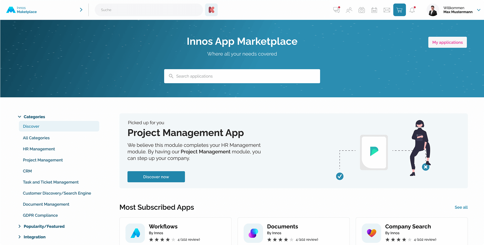
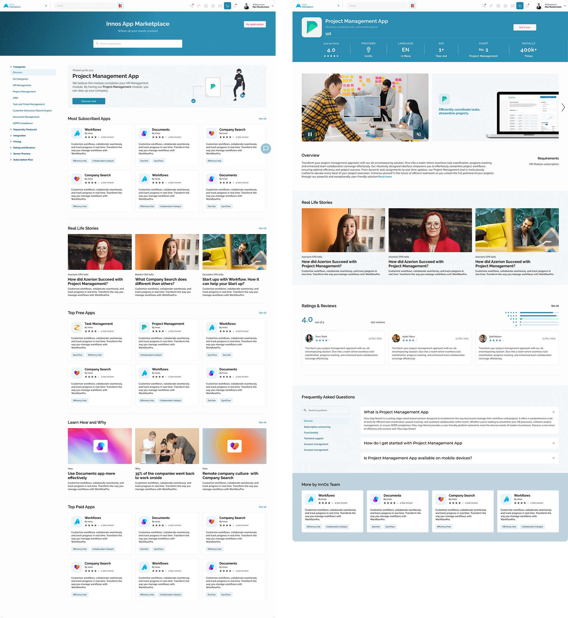
After completing the competitor analysis, I moved into wireframing the key pages. I began with the Marketplace homepage, which needed to balance two goals:

* Support goal-oriented users who come with a specific product in mind.
* Encourage exploration for users who may not know what else is available.

I placed the search bar at the top of the page — a common entry point for task-oriented users — but kept it compact to preserve space for product discovery sections.

On the left side, I introduced a persistent filter navigation, allowing users to explore products by category or function as the platform scales and more apps are added.

The default tab is the “Discover” page, which gives us the opportunity to promote curated, high-value modules and increase exposure to lesser-known products.

One of the most important UX decisions was the creation of the “Picked for You” section, which recommends modules that complement the user’s existing subscriptions.For example, in our test case, the user already has the HR Management module. The interface suggests the Project Management module with supporting copy:
"We believe this module complements your HR Management setup. By adding Project Management, you can take team efficiency and goal-tracking to the next level."

This creates a logical and personalized upgrade path, boosting perceived value and engagement.Additional homepage sections include:

Top Paid Apps / Most Subscribed: Adds social proof and trust.
Learn How & Why: Educational content on how to use modules effectively.
Real Life Stories: Featuring real professionals talking about how Innos helped them grow or streamline their business.

On the Product Detail Page, I extended this approach by embedding:

“Real Life Stories” from users who have adopted the app, offering authentic use cases and emotional resonance.
A “More from this Creator” module at the bottom, helping users discover related products from the same development team — a subtle nudge for cross-sell.

I intentionally designed these elements to support both first-time visitors and power users, while increasing discoverability and driving trust through human-centered storytelling.

UI Design

When moving into the UI design phase, I focused on maintaining visual consistency with the existing design system provided in the example Figma pages. Wherever possible, I reused the existing components to ensure alignment with the established look and feel of the product.

For new interface elements that were not included in the original file, I carefully designed custom components that followed the same style rules — including spacing, corner radius, iconography, and typography — to create a seamless and unified interface.

The base palette leaned heavily toward cool blue tones, which established a sense of professionalism and trust. However, to balance this and bring warmth and life into the overall experience, I selectively introduced warm tones through imagery. The photos used across the product cards and success stories include consistent use of oranges, yellows, green, and warm lighting to subtly enrich the design without clashing with the brand aesthetic.

This interplay between cool UI elements and warm supporting visuals created a balanced, approachable atmosphere — helping the app feel both structured and human-centered.